

The colors can have a deep effect on us, both mentally and physically. And color therapy has become an increasingly popular practice in the use of various shades to stimulate positive emotions and improve well -being.
As for our homes, the simple painting of the walls is one of the fastest and most simple ways to «restore» and make an update not only to the house, but to the whole atmosphere. But where do we start from? And what colors and combinations will they work better to build spaces that calm us down and play our balance?
Read this article below, because the specialists of the mural shop are ready to share some suggestions and ideas for the arrangement to create quiet spaces that contrast daily chaos in our life.
Pastel colors for bedroom
The bedroom is a place where we want to feel comfortable and safely, a quiet sanctuary that we use to relax in the evening and wake up and wake up and rest.
In the world of interior design, where bold and bright colors often occupy the center of the scene, there is a more «good» alternative: soft pastel shade. They have a relaxing visual effect, increasing the feeling of harmony and for the fact that they have a smaller saturation, this makes them very offered in terms of combinations.
For example, the shades of rose with green ones: a more harmonious and delicate complementary duo of a contrasting combination of green and red that may seem hard and disturbing.
And if the entire layout scheme with light, natural and decorations characterized by curved lines, you will get a result defined by harmony, fluidity and delicacy.

Living: a relaxation sanctuary
Living are spaces where we relax with family and friends. On average, we spend 20% of the time in these rooms, so they have a huge impact on our general mood.
Thin and refined, the «quiet luxury» tendency continues to be popular at the beginning of 2024. It is a discreet, but sophisticated, thin, but never boring aspect. A contemporary style that is the definition of Ethos «less means more».
Associates hot neutrals such as cream, beige and white to create an effortless space, which is luxurious, but without flaunting. Add depth to the arrangement by integrating the layers of mixed materials, such as closed wood, marble and soft textile materials.
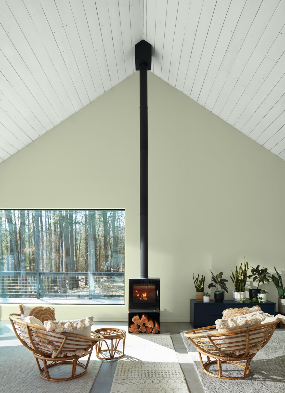
Another approach to your living room is inspired by well -being, because their design is focused on the promotion of health and harmony. Often you will see these spaces using the vegetation (thanks to their association with vitality and update) combined with white, to create a fresh and clean atmosphere.
You can also associate these colors with decorations and furniture made with organic materials such as rattan and in. Incorporation of plants and maximize natural light while maintaining open windows will have a positive impact, because both activities support physical health and mental well -being.
Input hall: visit your home card
Whether it’s an extravagant entrance or a modest room, the transition spaces at home deserve the same care and attention in their design as any other room. These are the spaces that give the tone to the arrival of the guests.
Then, choose the shades that correspond to these connection spaces to create a perfectly harmonized flow between the spaces.
Often known as the «new neutral», the pink plaster gives a pleasant appearance to any area. This soft rose next to a greenish gray shade, for example, will create a sophisticated and elegant atmosphere and will allow you to play with the finishes for a final look that will steal all eyes.

At the same time, you can consider a tonal or monochromatic scheme. This scheme uses different shades of the same color to create an easy contrast, while maintaining a feeling of simplicity, being incredibly easy to integrate into your home.
On the other hand, you can play with the undertones of color combinations.
As a general rule, cold basements work very well in areas that receive more natural light, instilling a feeling of awakening, while the hot subtons will give a warm and welcoming feeling. And for the interiors characterized by the style, we suggest you choose colors that have the same undertones to give a harmonious feeling.
latest posts published

American Kitchen – A comfortable, useful and welcoming space

What the online pandemic visits on the personality of the host say

Trends in the efficient arrangement of the bedroom

5 boxes to verify the design and organization of a home kitchen

Retro style in interior design

Bathroom furniture items

The kitchen furniture that masks the boiler, the refrigerator and the dishwasher

Why choose your furniture for your home

The balcony, storage and relaxation space
